Dragome exists thanks to your donations
Help us continue to make it better

Creating entity CRUD grid with Dragome SDK
What is Dragome?
Dragome is a software development kit (SDK) for creating RICH Internet Application(RIA). It provides developers a mechanism to write client side application in Java.
Javascript code is generated directly from bytecode which gives a lot of advantages in comparison to source to source transformations.
Dragome is open source, completely free, and it is licensed under the GPL v3.0.
Why use the Dragome SDK?
- Code everything in Java (server side and client side), it will be transformed to javascript automatically.
- Higher level of abstraction for GUI development using components.
- High performance for generated client side code.
- Java based development process and code reuse.
- Use the excellent debugging support offered by the mature Java IDEs like Eclipse, developers can debug the client side application just as an Java Application.
- Make use of built-in IDE support to refactor Java code, improve your agile development.
- You will minimize contact with HTML files. Managed by graphics designers not developers, Dragome uses exactly the same files that designers are editing, just plain HTML files.
- UI design updates can be deployed by non developer roles because code is totally decoupled from HTML files.
- Use continuation in your development: you can pause your program and continue it whenever you need.
- Unit testing integration: you can also run your Junit tests on a browser.
- Java 8 enabled.
Dragome SDK modules
Dragome SDK can be divided into following five major parts:
- Dragome Bytecode to JavaScript compiler : This is the most important part of Dragome which makes it a powerful tool for building RIAs. Dragome compiler is used to translate all the application code written in Java into JavaScript.
- JRE Emulation library : Dragome includes a library that emulates a subset of the Java runtime library.
- Form Bindings: Based on gwt-pectin project this module provides easy data bindings capabilities. It uses a declarative style API (guice style) for defining the models, commands and forms as well as binding them to components.
- Callback evictor: In charge of getting rid of callback hell, it uses bytecode instrumentation and dynamic proxies to do it.
- Method logger: Simple method interceptor for automatic model changes detection, it also make use of bytecode instrumentations.
Dragome provides two execution modes, production mode for executing everything in client side, and debug mode that executes all in Java Virtual Machine without compiling to javascript and make remotes updates to browser DOM.
System Requirements
- JDK 1.7 or above.
- Memory no minimum requirement.
- Disk space no minimum requirement.
- Operating System no minimum requirement.
- Important note about debugging: it is not required the use of any plugin for your IDE or for your browser. Applications can be debugged on modern versions of Chrome, Firefox, Opera and IE 11. Safari will be available in future versions.
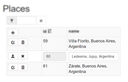
Crud Grid example
This example is based on AngularJS CRUD Grid with WebApi, EF, Bootstrap, Font Awesome & Toastr. See original demo here.
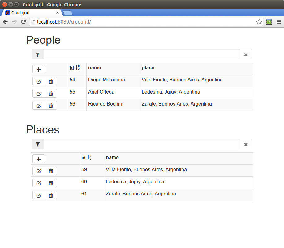
This tutorial is about Dragome version of the same crud grid application. We are using a Java server side service for interacting to a embedded database, through Hibernate for ORM mapping.
For UI construction we are using Component Builders mechanism provided by Dragome, which handles several similar concepts to AngularJS framework: two-way data binding, switch/case template approach, show or style components using expressions, automatic detection of model changes, event handling, template repeaters with filtering and ordering capabilities, etc.
Component Builders mechanism is just a layer above Dragome UI components and Form Bindings module, that make components construction a lot easier.
The same application could be achieved using components directly but is would be more verbose and more
difficult to implement in order to get same data binding advantages.
Also it could be implemented by DOM manipulations and direct event handling, just as Dragome components do it internally, but again it could be a lot more verbose, and since there would be almost any abstraction layer in this usage, it could be a very difficult task to accomplish.
Server-side code
There is only one class in server side, this is the implementation of our service that provides instances of required entities as well as metadata for UI creation.
It handles interactions to ORM by EntityManager, such as finding, removing, saving and updating entities.
Also it provides metadata for both entities Place and People.
See how to use services here.
Client-side code
All the remaining code is going to be executed at client side, this java code will be transformed to javascript and will be loaded by the browser in order to: create UI, manipulate entities instances, serialize/deserialize data structures, establish communication to server, etc.
Our first setup is about creating a CrudGrid instance, that's the main model we are going to use, passing it which entity we want it to show. Then for start building all components we will use a ComponentBuilder constructed with current VisualPanel, where all components and subcomponents will be hanging on.
To see how to use templates take a look at Template Engine.
CrudGrid crudGrid= new CrudGrid(entityType);
ComponentBuilder componentBuilder= new ComponentBuilder(this);
Filter section
First section we are constructing is filter panel.
A Textfield is binded to filter property of crudGrid instance using toProperty method, we've previously chosen VisualTextField component to represent this value in view.
In “remove-filter” case we also add a condition to make it disable when a expression is satisfied.
For cleaning purposes we attached a click listener to set filter string to empty value, so due two-way data binding filter will be cleaned by clicking this button and automatically filter component (the textfield) will be refreshed with this new value.
Source code
private void buildFilter()
{
    componentBuilder.bindTemplate("filter")
        .as(VisualTextField.class)
        .toProperty(crudGrid::getFilter, crudGrid::setFilter)
        .build();

    componentBuilder.bindTemplate("remove-filter")
        .as(VisualLabel.class)
        .disableWhen(() -> crudGrid.getFilter().length() == 0)
        .onClick(v -> crudGrid.setFilter(""))
        .build();
}
Associated HTML fragment
<div class="input-group col-md-5 row filter">
    <span class="input-group-addon"><i class="glyphicon glyphicon-filter"></i></span>
    <input type="text" class="form-control" data-template="filter">
    <span class="input-group-addon btn btn-default" data-template="remove-filter"><i class="glyphicon glyphicon-remove"></i></span>
</div>
Header
For “add-mode-toggler” we also add a condition but in this case for styling purposes, each style provided will be applied whenever “accordingTo” boolean expression takes true or false value.
At this point we need to create each column header with: sorting behavior, configured style, and showing its name. For repeating “table-header” template for each column in crudGrid.getColumns() we use “repeat” method.
Repeat method will execute the passing block for each column, this block will receive a column instance and a builder for continuing parent construction and also building new inner components.
Source code
private void buildHeader()
{
    componentBuilder.bindTemplate("add-mode-toggler")
        .as(VisualLabel.class)
        .onClick(v -> crudGrid.toggleAddMode())
        .styleWith("glyphicon-minus", "glyphicon-plus")
        .accordingTo(() -> crudGrid.isAddMode())
        .build();


    componentBuilder.bindTemplate("table-header")
        .as(VisualPanel.class)
        .toList(crudGrid.getColumns())
        .repeat((column, builder) -> {
            builder.onClick(() -> crudGrid.setOrderColumn(column)).build();
            builder.styleWith(column.getStyleName()).when(() -> true);

            builder.bindTemplate("column-name")
                .as(VisualLabel.class)
                .to(() -> column.getName())
                .build();

            builder.bindTemplate("order-icon")
                .as(VisualLabel.class)
                .styleWith("glyphicon-sort-by-alphabet", "glyphicon-sort-by-alphabet-alt")
                .accordingTo(() -> crudGrid.getOrderColumn().getOrder().equals(Order.ASC))
                .showWhen(() -> crudGrid.getOrderColumn() == column)
                .build();
        });
}
Associated HTML fragment
     <tr>
        <th class="col-md-1">
            <div class="btn-toolbar"><i class="btn btn-default glyphicon" data-template="add-mode-toggler"></i></div>
        </th>

        <th data-template="table-header">
            <div>
                <span data-template="column-name"></span>
                <i class="glyphicon" data-template="order-icon"></i>
            </div>
        </th>
    </tr>
Add section
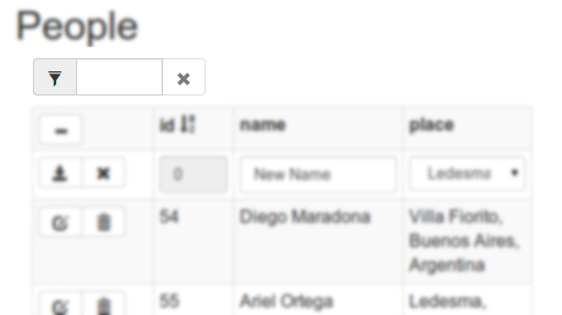
In this section we need to show different components depending on lookup property of the column. To do that we make use of a tool for selecting templates using a expression. We repeat each column as previous section but inside each template we want to show a combobox or textfield depending on if it is a lookup value or not.
Using switchWith command we configure the desire switch expression, then inside children creation we may express default case using switchDefaultCase , and switchCase for specific case value. Both methods receive a code block that is in charge of building the entire case component/s.
Only components that belong to current case will be constructed and shown.
Source code
private void buildAddSection()
{

...

childrenBuilder.bindTemplate("columns")
    .as(VisualPanel.class)
    .toList(crudGrid.getColumns())
    .repeat((column, builder) -> {

        builder.switchWith(() -> !column.isLookup()).buildChildren(columnBuilder -> {

            columnBuilder.bindTemplate("input")
                .switchDefaultCase((caseBuilder) ->
                    caseBuilder
                    .as(VisualTextField.class)
                    .toProperty(() -> crudGrid.getItem().getObject(), column.getName())
                    .disableWhen(() -> column.isAutoincrement())
                    .build());

            columnBuilder.bindTemplate("select")
            .switchCase(() -> false, (caseBuilder) ->
                caseBuilder
                .to(new VisualComboBoxImpl(crudGrid.getLookupData(column.getLookupEntityType())))
                .toProperty(() -> crudGrid.getItem().getObject(), column.getName())
                .showWhen(() -> column.isLookup())
                .build());
        });
    });

....
Associated HTML fragment
        <td data-template="columns">
            <input class="form-control" data-template="input"/>
            <select data-template="select" class="form-control"></select>
        </td>
Objects section
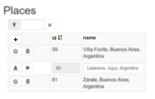
Using the same mechanism from above to repeat columns we are repeating each item, item class contains a reference to the entity itself. In this case we want repeat them in a particular order and filtering each one by a specific expression.
For orderBy method we specify a getter that allows repeater mechanism to obtain the value to compare to, and we also specify the ascending or descending order we want to use.
For filter purposes we use filter method, specifying a tester supplier to test each item whether it has to be shown or not.
Source code
private void buildObjects()
{
    componentBuilder.bindTemplate("objects")
        .as(VisualPanel.class)
        .toListProperty(crudGrid::getItems)
        .orderBy(crudGrid.getColumnValueGetter(), () -> crudGrid.getOrderColumn().getOrder())
        .filter(crudGrid::getFilterTester)
        .repeat((item, itemBuilder) -> {
            buildToolbar(item, itemBuilder);
            buildColumns(item, itemBuilder);
        });
}
Associated HTML fragment
    <tr data-template="objects">
        <td>
            <div class="btn-toolbar" data-template="toolbar">
                <div class="btn-group" data-template="view-mode">
                    <i class="btn btn-default glyphicon glyphicon-edit" data-template="edit"></i>
                    <i class="btn btn-default glyphicon glyphicon-trash" data-template="trash"></i>
                </div>
                <div class="btn-group" data-template="edit-mode">
                    <i class="btn btn-default glyphicon glyphicon-save" data-template="save"></i>
                    <i class="btn btn-default glyphicon glyphicon-remove" data-template="remove"></i>
                </div>
            </div>
        </td>
        <td data-template="columns">
            <div data-template="view-mode">
                <span data-template="not-lookup"></span>
                <span data-template="lookup"></span>
            </div>

            <div data-template="edit-mode">
                <input class="form-control" data-template="input"/>
                <select data-template="select" class="form-control"></select>
            </div>
        </td>
    </tr>
Showing values
In order to show all column values we need to repeat each one, access the particular value and decide how to show it.
In this last section we can see the usage of nested switch/cases commands, at top level code we use a switch for selecting editMode case (inline editing).
The second switch is inside edit-mode case, there we need to choose whether to show a textfield or combobox depending on lookup property of current column.
buildColumns source code
private void buildColumns(Item item, ComponentBuilder itemBuilder)
{
    itemBuilder.bindTemplate("columns")
        .as(VisualPanel.class)
        .toList(crudGrid.getColumns())
        .repeat((column, columnBuilder) -> {

            columnBuilder
                .switchWith(() -> item.isEditMode())
                .buildChildren(columnChildrenBuilder -> {
                    buildViewMode(item, column, columnChildrenBuilder);
                    buildEditMode(item, column, columnChildrenBuilder);
                });
        });
}
buildEditMode source code
private void buildEditMode(Item item, Column column, ComponentBuilder columnChildrenBuilder)
{
    columnChildrenBuilder.bindTemplate("edit-mode")
        .switchCase(() -> true, (caseBuilder) -> {
            return caseBuilder
                .as(VisualPanel.class)
                .switchWith(() -> !column.isLookup())
                .buildChildren(viewModePanelBuilder -> {
                    viewModePanelBuilder.bindTemplate("input")
                        .switchDefaultCase((lookupCaseBuilder) ->
                            lookupCaseBuilder
                                .as(VisualTextField.class)
                                .toProperty(item.getObject(), column.getName())
                                .disableWhen(() -> column.isAutoincrement())
                                .build());

                    viewModePanelBuilder.bindTemplate("select")
                        .switchCase(() -> false, (lookupCaseBuilder) ->
                            lookupCaseBuilder
                            .to(new VisualComboBoxImpl<>(crudGrid.getLookupData(column.getLookupEntityType())))
                            .toProperty(item.getObject(), column.getName())
                            .disableWhen(() -> column.isAutoincrement())
                            .build());
                }).build();
        });
}
Main model
The whole UI is interacting with a model called CrudGrid, that is in charge of storing the information, performing actions over model, communicating to server service, and providing some tools to help builders to create the UI.
This class is totally decouple from Dragome UI creation, builders, methodlogger or any framework specific mechanism.
The only coupling point is using ObservableList instances for detecting list changes automatically, but it could be considered framework agnostic because it only interacts with a listener inside.
public class CrudGrid
{
    private boolean loading= true;
    private String filter= "";
    private boolean addMode;
    private List<Item> objects;
    private Item item;
    private List<Column> columns;
    private Tester<Item> filterTester= updateFilterTester();
    private Column orderColumn;
    private EntitiesProviderService entitiesProviderService;
    private Class<?> entityType;

    public CrudGrid(Class<?> entityType)
    {
        this.entityType= entityType;
        List<Identifiable> all= entitiesProviderService.getAll((Class) entityType);
        List<Item> result= new ArrayList<Item>();
        for (Identifiable object : all)
            result.add(new ItemImpl(object));

        objects= new ObservableList<Item>(result);
        columns= new ObservableList<Column>(entitiesProviderService.getColumnsFor(entityType));

        item= initItem();
        orderColumn= columns.get(0);

        setLoading(false);
    }

    public void addObject()
    {
        getItems().add(item);
        Identifiable added= entitiesProviderService.add(item.getObject());
        item.getObject().setId(added.getId());
        toggleAddMode();
    }

    public void deleteObject(Item item)
    {
        objects.remove(item);
        entitiesProviderService.delete(item.getObject());
    }
...
Complete template for CrudGridComponent
Generally, UI code is related to a HTML template that contains nested elements with data-template attributes, matching the same name of bindTemplate usages.
You can see there is no coupling between templates and java code, except for those data-template attribute that mark where is each template and subtemplate.
There is no logic inside templates, they are pure HTML with no special tags and standard attribute usage. It make them interchangeable with other templates with the same specification (same nested data-templates in elements).
Graphic designers may work decoupled from developers in all development phases, UI design updates can be performed by any role cause there is no intervention from developers perspective required.
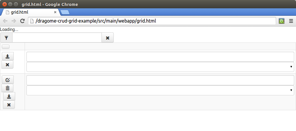
<body>
<div data-template="loading">Loading...</div>
<div class="input-group col-md-5 row filter">
    <span class="input-group-addon"><i class="glyphicon glyphicon-filter"></i></span>
    <input type="text" class="form-control" data-template="filter">
    <span class="input-group-addon btn btn-default" data-template="remove-filter"><i class="glyphicon glyphicon-remove"></i></span>
</div>

<table class="crud-grid table table-striped table-bordered table-condensed table-hover">
    <tr>
        <th class="col-md-1">
            <div class="btn-toolbar"><i class="btn btn-default glyphicon" data-template="add-mode-toggler"></i></div>
        </th>

        <th data-template="table-header">
            <div>
                <span data-template="column-name"></span>
                <i class="glyphicon" data-template="order-icon"></i>
            </div>
        </th>
    </tr>
    <tr data-template="add-section">
        <td>
            <div class="btn-toolbar">
                <div class="btn-group">
                    <i class="btn btn-default glyphicon glyphicon-save" data-template="save-button"></i>
                    <i class="btn btn-default glyphicon glyphicon-remove" data-template="remove-button"></i>
                </div>
            </div>
        </td>
        <td data-template="columns">
            <input class="form-control" data-template="input"/>
            <select data-template="select" class="form-control"></select>
        </td>
    </tr>
    <tr data-template="objects">
        <td>
            <div class="btn-toolbar" data-template="toolbar">
                <div class="btn-group" data-template="view-mode">
                    <i class="btn btn-default glyphicon glyphicon-edit" data-template="edit"></i>
                    <i class="btn btn-default glyphicon glyphicon-trash" data-template="trash"></i>
                </div>
                <div class="btn-group" data-template="edit-mode">
                    <i class="btn btn-default glyphicon glyphicon-save" data-template="save"></i>
                    <i class="btn btn-default glyphicon glyphicon-remove" data-template="remove"></i>
                </div>
            </div>
        </td>
        <td data-template="columns">
            <div data-template="view-mode">
                <span data-template="not-lookup"></span>
                <span data-template="lookup"></span>
            </div>

            <div data-template="edit-mode">
                <input class="form-control" data-template="input"/>
                <select data-template="select" class="form-control"></select>
            </div>
        </td>
    </tr>
</table>
</body>Google+